Air Force UX Design Case Study – Outcomes of UX Design Approach
How Air Force CyberWorx Contributes to the Mission
The United States Air Force has a mission: “Fly, fight, and win — airpower anytime, anywhere.”
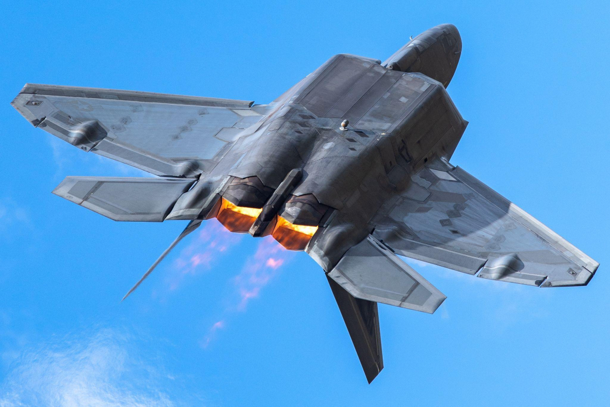
Fly. Fight. Airpower. What images come to mind when you read the Air Force mission statement? An F-22 over clouds and blue sky, the glow of afterburners trailing behind? A pilot in a cockpit, ready to go in helmet and oxygen mask?
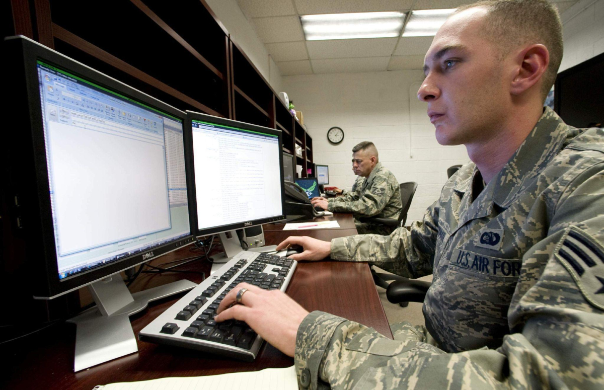
Yes, those are the right images. And so is the behind-the-scenes Airman, fingers on keyboard at a desk, navigating through flight-scheduling software and making sure flight schedules run smoothly for every individual pilot, at the right place, at the right time.
Flight scheduling is part of the mission: “airpower anytime, anywhere.”
Using UX Design to Improve Flight Scheduling
In Summer 2022, AF CyberWorx conducted extensive User Experience and Human-Centered Design research and initial prototyping for the software development team Kessel Run and Air Combat Command (ACC).
Our primary goal: understand the user requirements for NOVA, a new flight-scheduling system.
It was important to address the needs of all interested stakeholders, from schedulers to pilots, to ensure the system becomes viable for all parties. So how did CyberWorx make a new flight scheduling platform both more efficient and more effective? With human-centered practices.

Basic processes are more efficient if we truly understand the users’ needs and how users can best complete a task. But efficiency is only half the equation; effectiveness in our tasks is just as important. “Efficiency is doing things right. Effectiveness is doing the right things,” says management consultant Peter Drucker.
The Human-Centered Design Process leads to fully understanding the core issue and determining the best path forward that meets the needs of all user types.
Human-Centered Design Process
In an extensive discovery-phase sprint, our team started with a current-state evaluation to dig into the existing platform and identify our primary research needs. Ask the right questions. Determine the weak points. Uncover the true needs of our work. We asked these and other questions:
- What are all the different user types that will be using this platform?
- How do they currently schedule flights, and what are their points of contention?
- What are existing best practices for this platform?
- What is the real problem we are trying to solve?
Once we felt confident in the answers we gathered, the team transitioned into observations of the current Patriot Excalibur (PEX) system that pilots and other stakeholders use. This way, we could account for the needs, wants, and frustrations of our target users during the design phase.
An example task we gave the user:
“Add an upcoming commitment for a dental appointment on September 30, 2022.”
While seemingly straightforward, tasks like this reveal a wealth of information about the usability of the current system based on how our stakeholders complete them.
After completing a series of user observations, we synthesized the information in order to create a development action plan. Together with Kessel Run, we agreed on the requirements for a minimum viable product (MVP) and developed a strategy to design wireframe mockups.
Next step: create low-fidelity wireframes, incorporating the user needs identified previously. Once satisfied that our design met our users’ requirements, we followed up with high-fidelity wireframes to illustrate the recommended UX/UI elements that would satisfy the scheduling tool’s need for a Human-Centered Design rework.
Outcomes of a UX Design Approach
This Human-Centered Design process, in conjunction with weekly collaboration meetings with Kessel Run, created a vision for the future development of a system that meets the needs of its warfighters on all sides.
CyberWorx’s intensive research and recommendations gave the Kessel Run team confidence that they are not merely replacing one flawed system with another, but instead allowing all interested parties to use the newly created NOVA system effectively.
By building the system with our UX design approach, the outcome will be that pilots, schedulers, and asset owners will greatly increase effectiveness and efficiency in their future flight scheduling.
Next Steps: Development and Usability Testing
With the groundwork and a usable design, Kessel Run entered into the development stage of the project. They have been working tirelessly to bring this UX design to life for the benefit of the Air Force warfighters.
Our next steps at CyberWorx are to support the development with ongoing design critiques from a human-centered perspective, as well as usability testing of new features as they are built. By continuing this partnership until development of an MVP is complete, we will keep the focus on the usability of the new system from the perspective of our target users.
If you take one lesson away from this UX design case study, let it be that the core of efficiency lies in the usability of your systems. Without a system that is truly built with their target users in mind, you are bound to create a drop in efficiency and effectiveness.
Did you find this informative? Check out our other projects!


